Master Thesis (Part 1)
— Project experience, AR/VR — 2 min read
(Design Space initial implementation)
Augmented Reality that allows us to superimpose information on shared external displays. The primary goal of my master thesis is to identify challenges in placing and understanding information in immersive visual analytics, in particular combining AR with external displays. At the first month of my internship, we built several Mixed reality Visualization prototypes to explore the design space. Below are our showcase of different visualization technics.
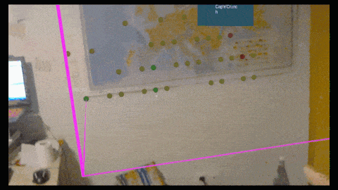
1. Map visualization
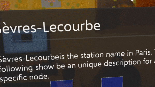
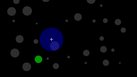
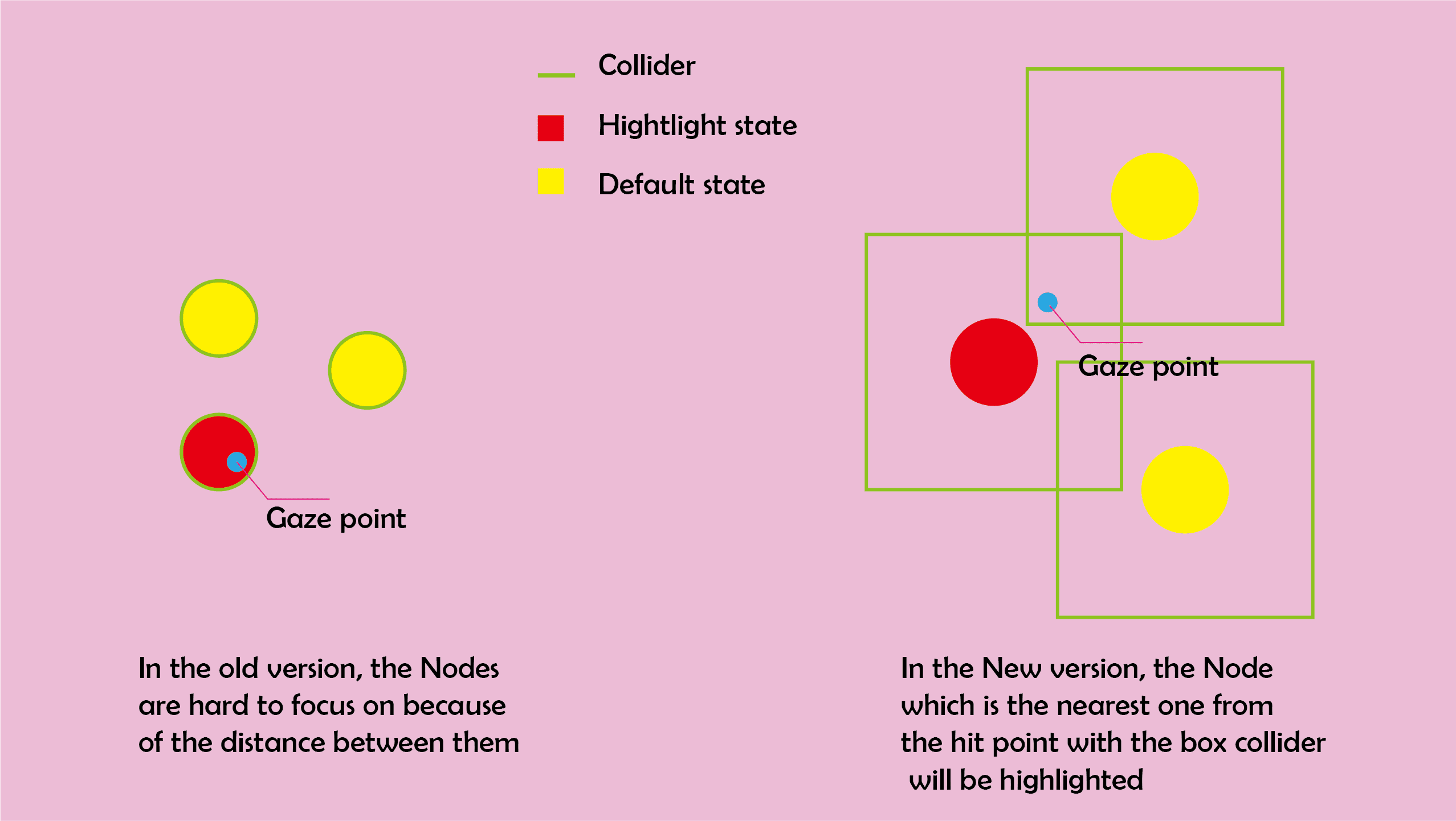
First type of visualization is the Map visualization. We encoded the data of the location of Paris metro system to a Map with Nodes showing the location of the stations. We built Taglong style panel for general information and labels always facing the user. And we also built a label for the sub-Visualization(label for a single metro line)One problem I was facing was that the size of each node is hard to control, this lead to difficulties focusing on a single node. I used a technology called bubble cursor which can increase the efficiency of hightlighting small objects. Instead of using the Camera system built in MRTK2, I build a stand alone camera system that supports RaycastAll( ) method.
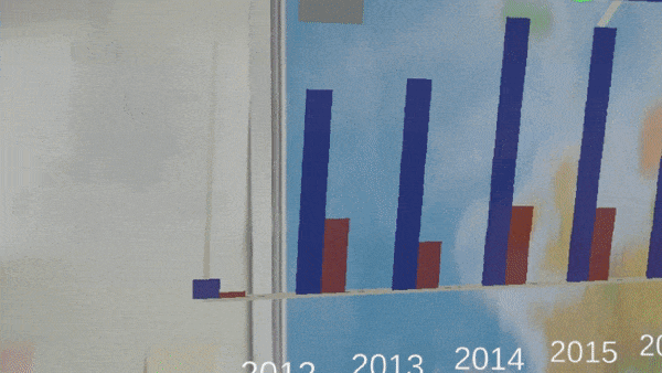
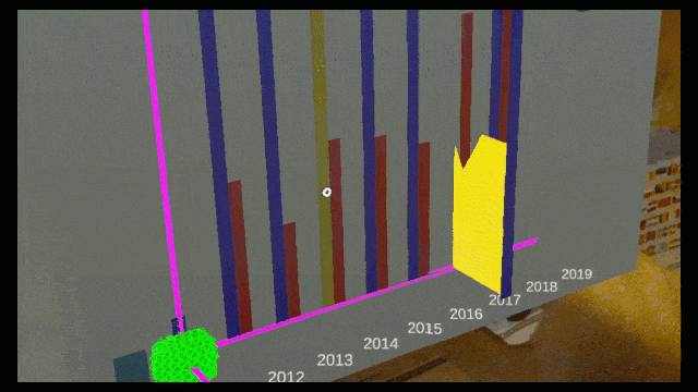
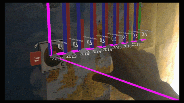
2. BarChart
The dataset for the MR barchart examples is the number of incident by year and type. At first I designed a 3D barchart which shows being more delightful in our discussion. This inspired us to come up with a new design which gives the BarChart a third dimension encoding. We call it Drawer BarChart.
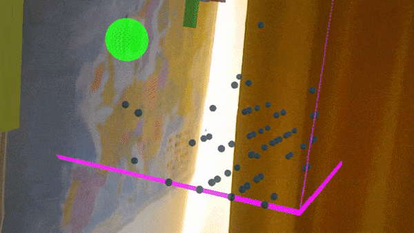
3. ScatterPlot
Both three types of 3D scatterPlot design is based on the Nutrition ingrediants of different types of cereal. The three dimensions are Protein,fat and sugar. Also I encoded color message represents calori level.The 3D Scatter Plot and the 3D ScatterPlot filter are using side view to represent different 2D information. The Scatter Dice, on the other hand,uses the transition animation to show the sense of 3D.One interesting point when I deal with the 3D scatterplot is that because the depth of different cluster, it’s difficult to local your focus on a particular data point. Instead of using bubble cursor as in map visualization, the user should focus on the same point for at leaset 0.2 second for the visualization to change the focus object. Another solution is as implemented in Scatter Plot Filter, use a filter to better explore the data.
4. Lenses
The purpose of a lense is to show different content on a different layer.We havee explored three kinds of Lenses
- 3DLense: the 3DLense is used to explore a 3D content on the top of Map visualization.This can be intuitive interaction regarding to Map exploring.
- Magnigication Lense: this is a Magnigicant Lense to explore detailed content
- Pyrimad Lense(Manhattan Lense): this is a Lense based on Magnigication Lense. The advantages of this kind of design is can also explore the hirearchy of different magnigicat level.

Thesis links
- Thesis part 1 (Design Space initial implementation)
- Thesis part 2 (Remote User testing Setup)
- Thesis part 3 (Resize and Interact with Mouse)
Reference
Bubble cursor :The bubble cursor: enhancing target acquisition by dynamic resizing of the cursor's activation area
Pyrimad lense :The DragMag image magnifier
Google Slides for discussion about the design space : https://docs.google.com/presentation/d/1CztHqgtRfOsDR7ku59sx09mgsfRWc0MoBbd9Xu719NI/edit?usp=sharing
Unity RaycastAll method : https://docs.unity3d.com/ScriptReference/Physics.RaycastAll.html