Lifinger
The Problem
We found out that there are problems for people delivering well in town. We have delivery services in long-distance, what about in the same city? People always have problems delivering stuff in the same city. The only existing solution is to ask help from friends or bring the item by themselves.
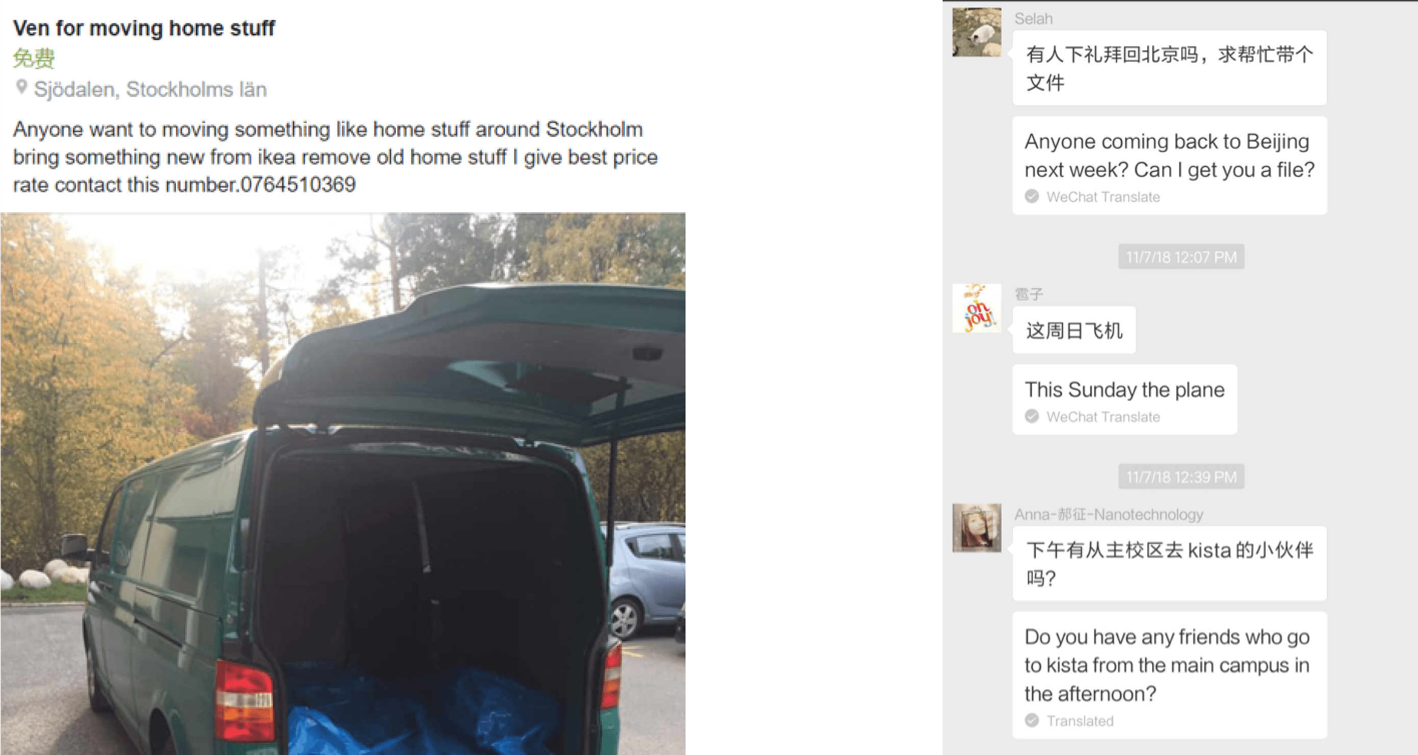
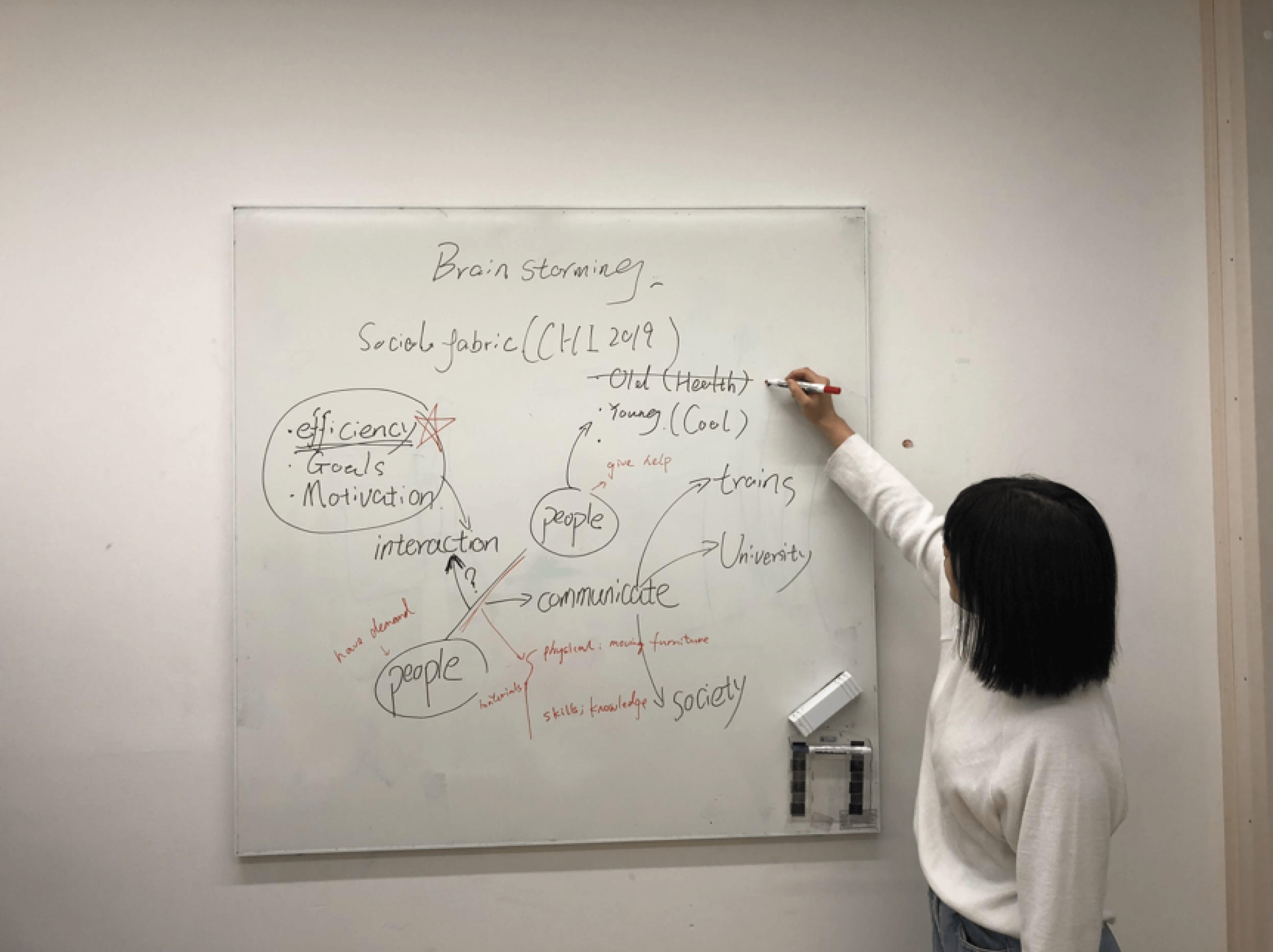
Figure1 Pictures from brainstorming and screen shot during Naturalistic Observation
The solution
Our design vision is to build a platform that provides on-the-way delivery service that connects people with stuff to send to individuals already heading that way.
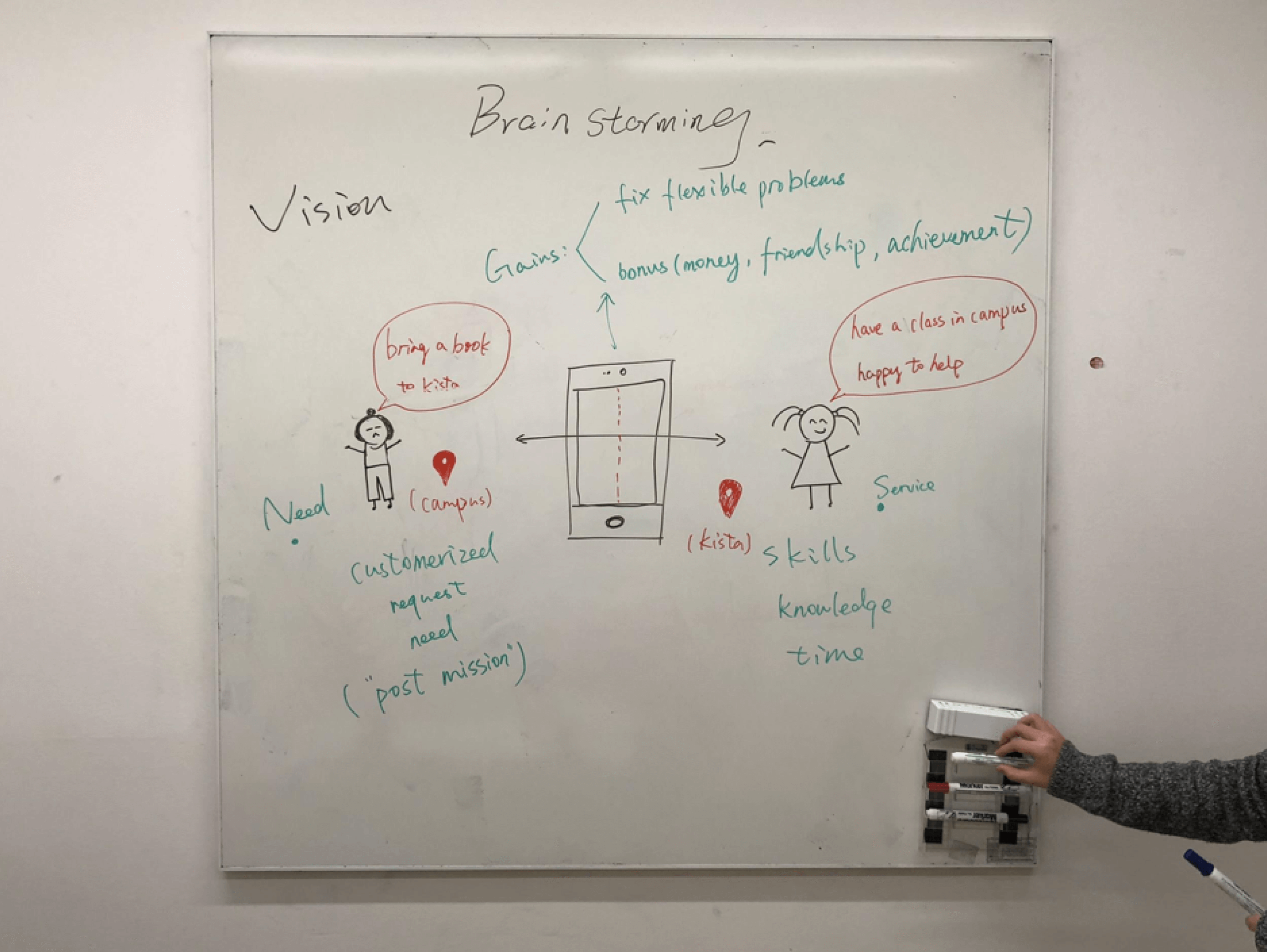
Figure2 Design vision
User Research
We conducted interviews on 17 individuals, age ranges from 20 to 47 years old to identify user needs and user patterns. Our main questions were:
- Is there any situation that people would prefer to pay money for help rather than ask for help from friends?
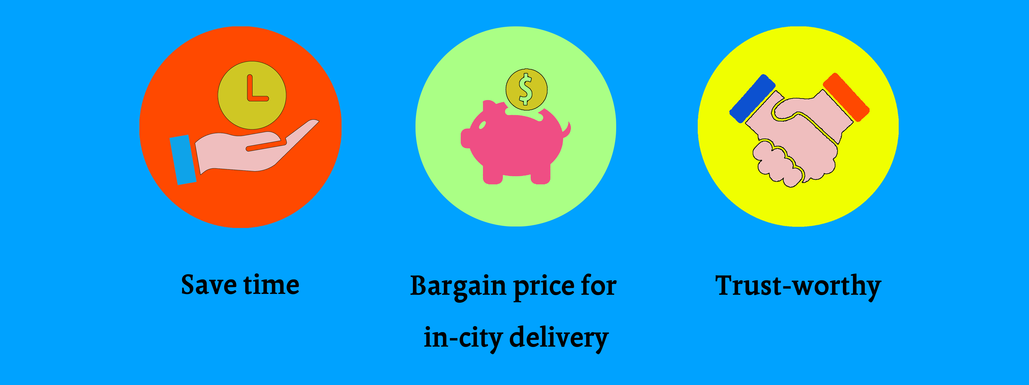
- Do people willing to pay to increase their efficiency and save time?
- What's their concern about help from strangers?
User need
User pattern
- Friendship-oriented individuals tend to like to ask for assistance from a friend. And also thinks this can enhance the relationship between each other
- Efficiency-oriented individuals can accept to pay a small amount of money which increases their efficiency dramatically.
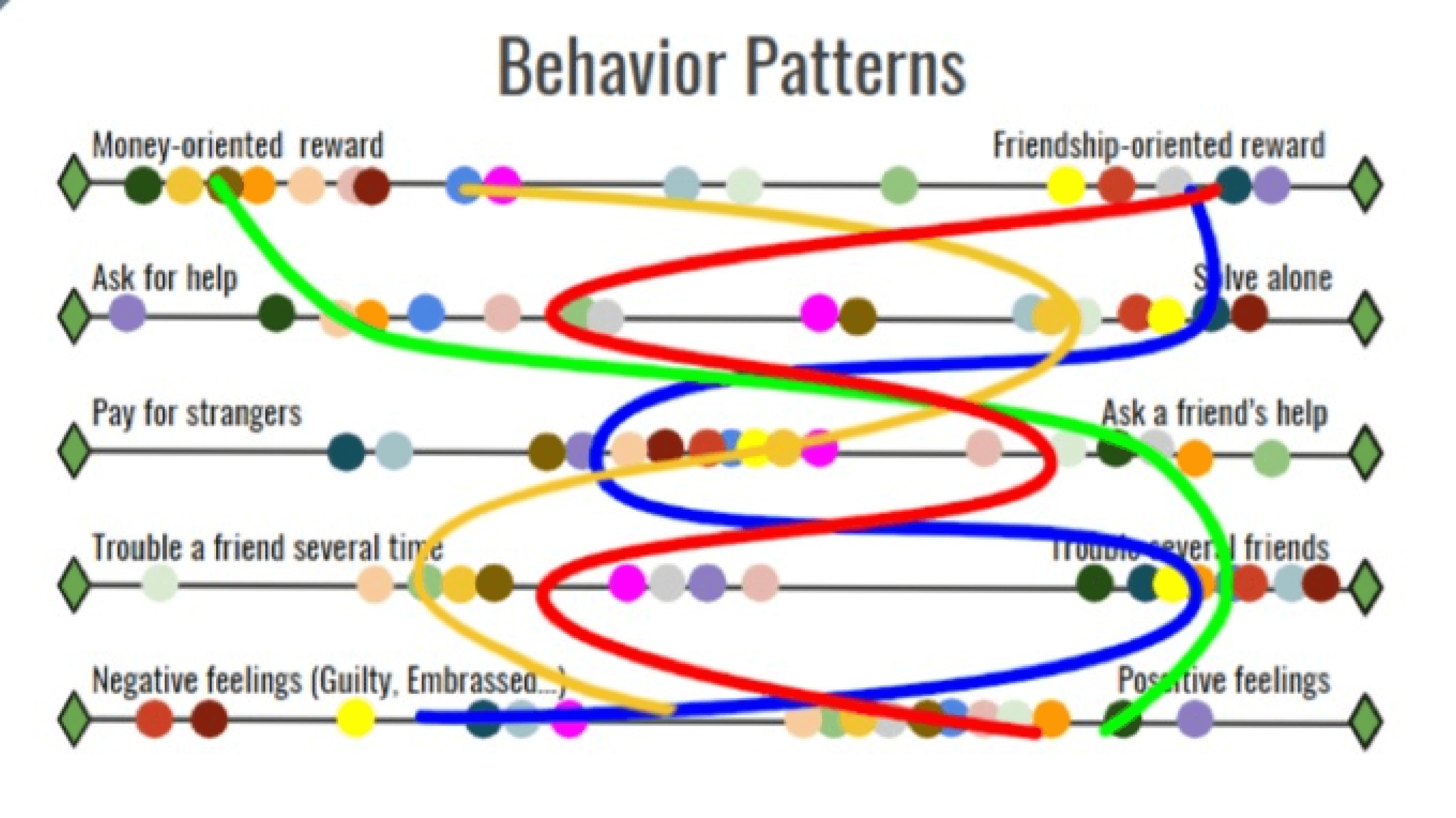
Figure3 Behavior pattern analysis
Identify user and scenario
To better communicate in our group and keep on the same page, we build four personas and one scenario for the user. We selected the primary persona, which we felt that her needs matches our user needs most.
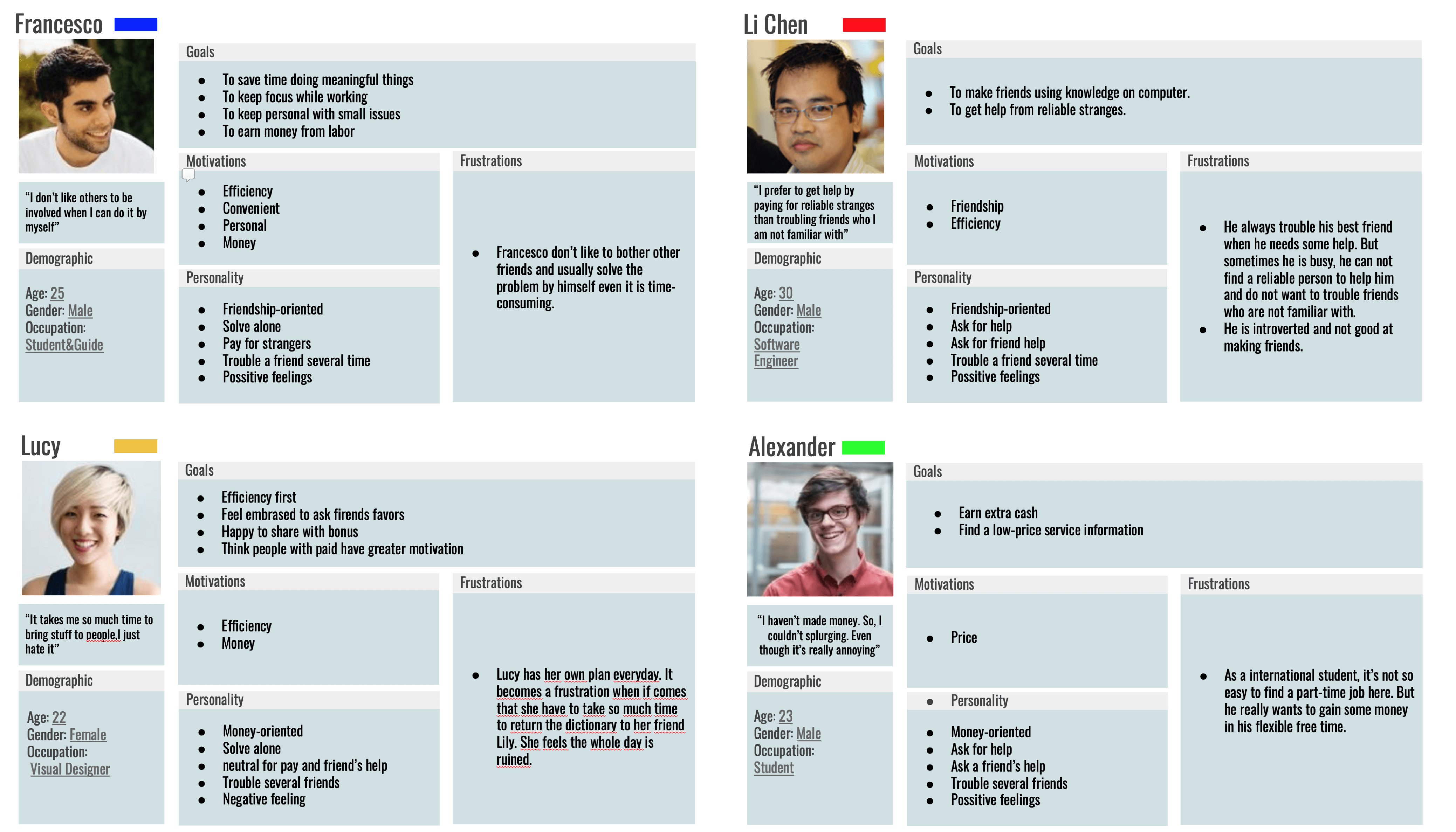
Figure4 Persona Analysis
Scenario
Lucy forgot to return the dictionary to Anna after the homework discussion. However, she lives far away from the place Anna lives in. Then Lucy posts a mission on lifinger and Julia accepted the mission because she is heading to the city center to buy a coat. Julia brings the book to Anna by her way to the city center and Lucy doesn’t have to travel a long distance just for a book.
Paper prototype&user evaluation
We defined two different types of interaction. One is list view another is the map view. We ended in conflicts about which is more practical. So we conducted user evaluation to test both prototypes.
According to our test objects, they thought that the map view is more intuitive and they need the information of location as essential information. So we decide to use the map view interaction as the main one.
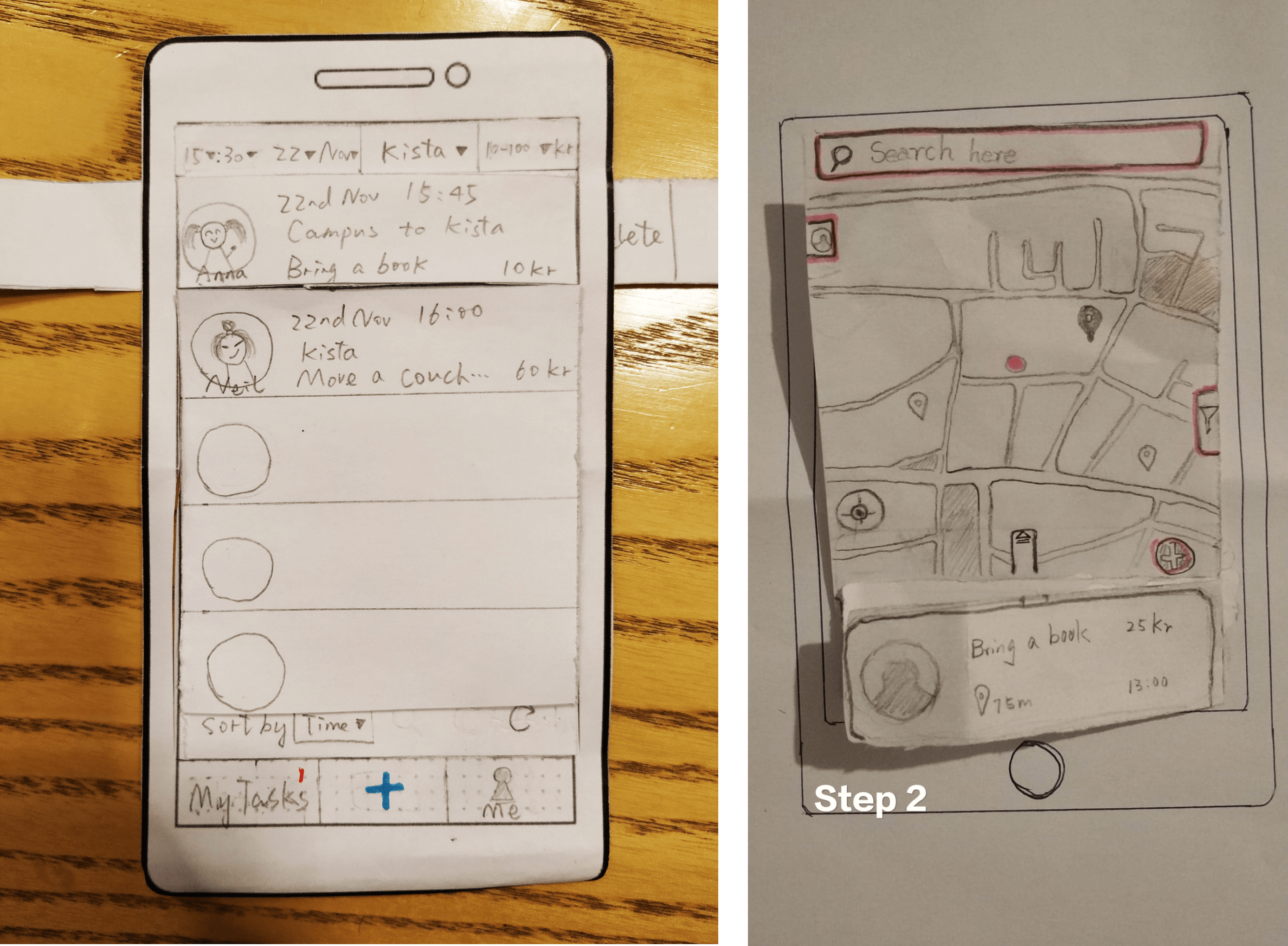
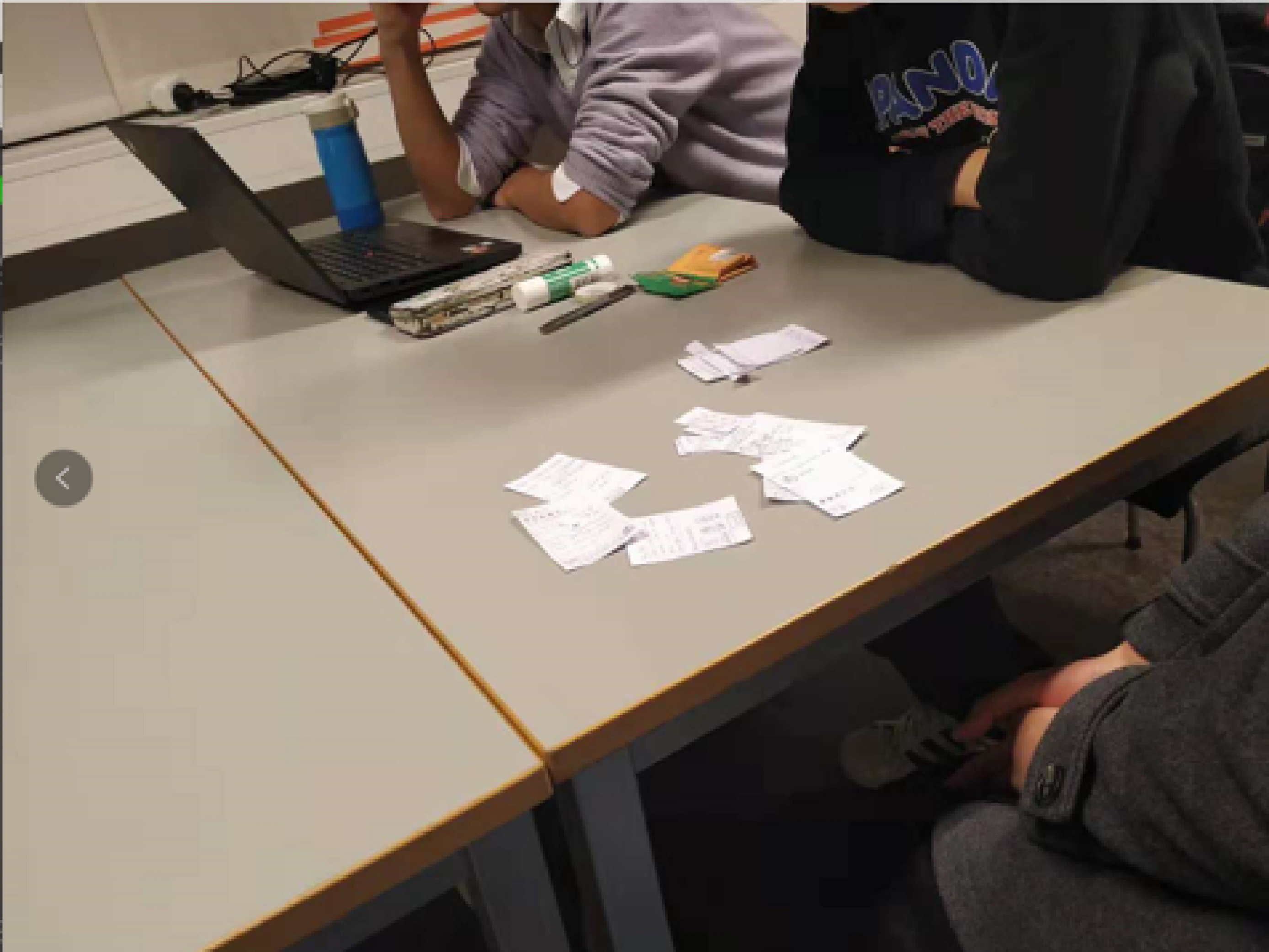
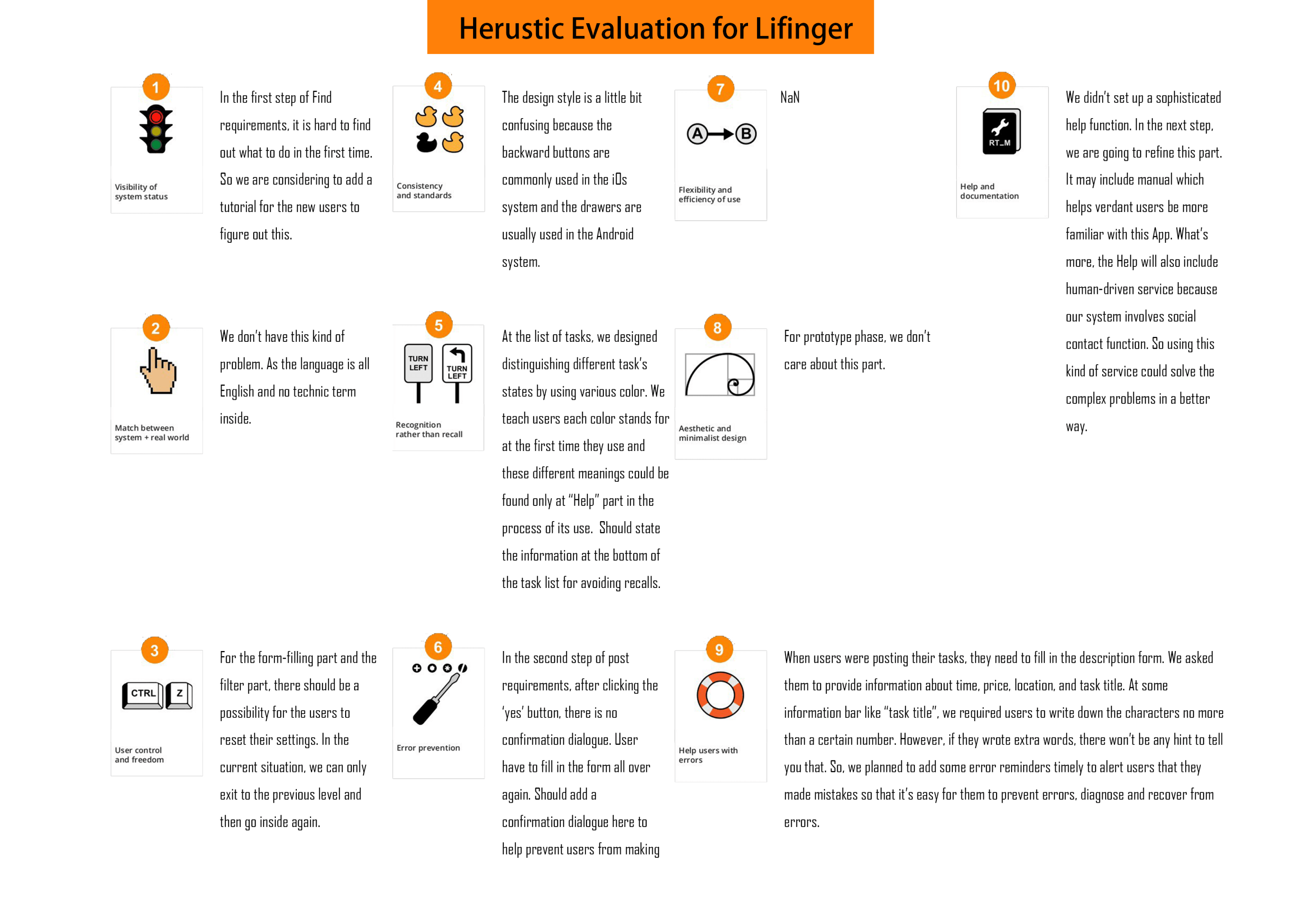
Figure4 Persona Analysis
Regarding to the evaluation part, we used two evaluation techniques. At first, we conduct user testing with five users to fix the system. Also, according to their feedback we decided to use a ballpoint pen instead of a pencil. We then did a heuristic evaluation to further investigate our system breakdowns.
Iteration
After the user evaluation phase, we redesigned our paper prototype (Click here to see the redesign)and built an interactive version via Marvel.
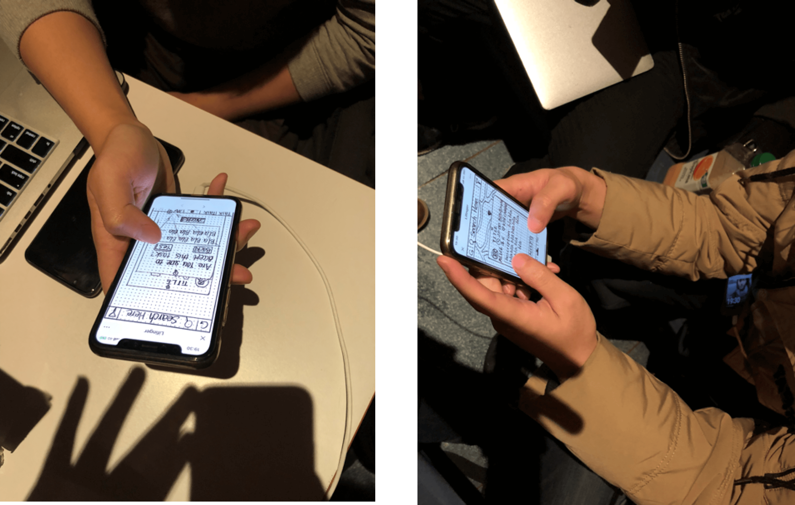
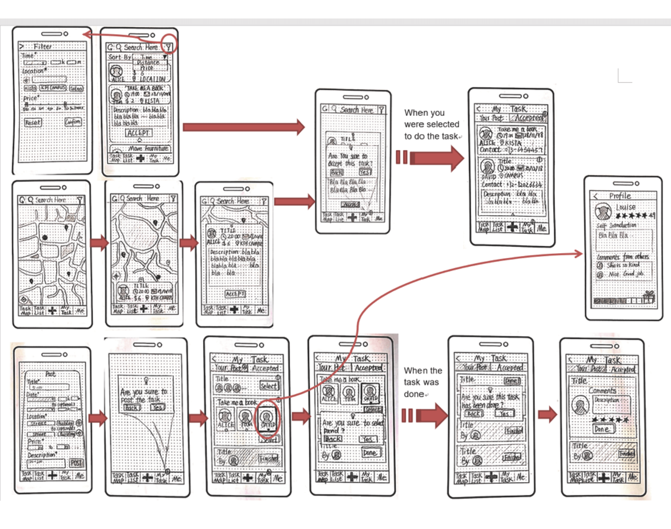
Figure5 First version paper prototype& paper prototype evaluation
Improvements
And to get a better understanding of the layout of the final product, we built a middle fidelity version. We did a third round iteration for improving the Final output.
- The state of selection is not clear enough
- Fat finger effect for the return button
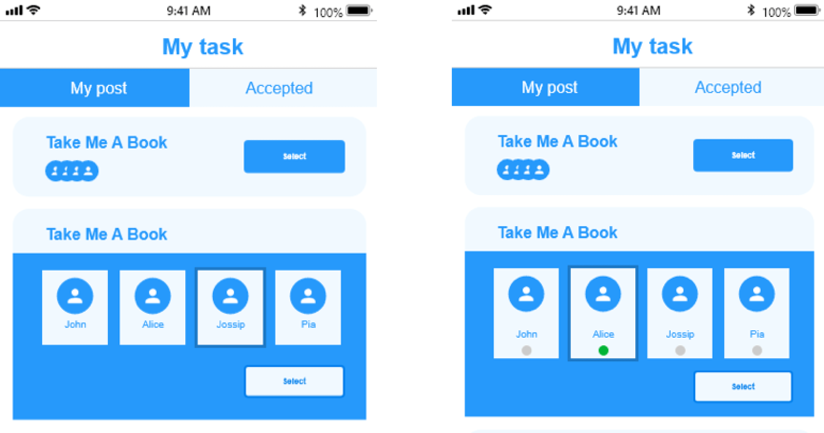

Figure5 First version paper prototype& paper prototype evaluation
Improvements
Self-reflection
In this design project, we truly searched for an interesting problem that doesn't have many solutions in the current market. I found building an "interactive" paper prototype useful, which is fast and more intuitive than the traditional paper prototype. What makes me surprised is that we conducted several iteration loops and still can find errors. This makes me realize the importance of iteration.
As for the breakdown of the design, we haven't really thought about the business model of the product, which may need more reflection on it.